In the Business Intelligence menu, click Data Cube.
The Data Cube opens on the Construction tab; this is the starting point for constructing data. The Construction view consists of the Data Catalog and the construction zone.
The data catalog, on the left, contains different measures, dimensions, and time dimensions that can be used to filter data.
The construction zone, on the right, contains the following areas:
Values — where you identify the measures to be enumerated
Columns — where you identify the dimension used to organize data by groups (e.g. based on time, location, organization, etc.)
Rows — where you can identify dimensions used to group the columns into subgroups
Filters — where you can limit the data, e.g. to a particular geographic location.
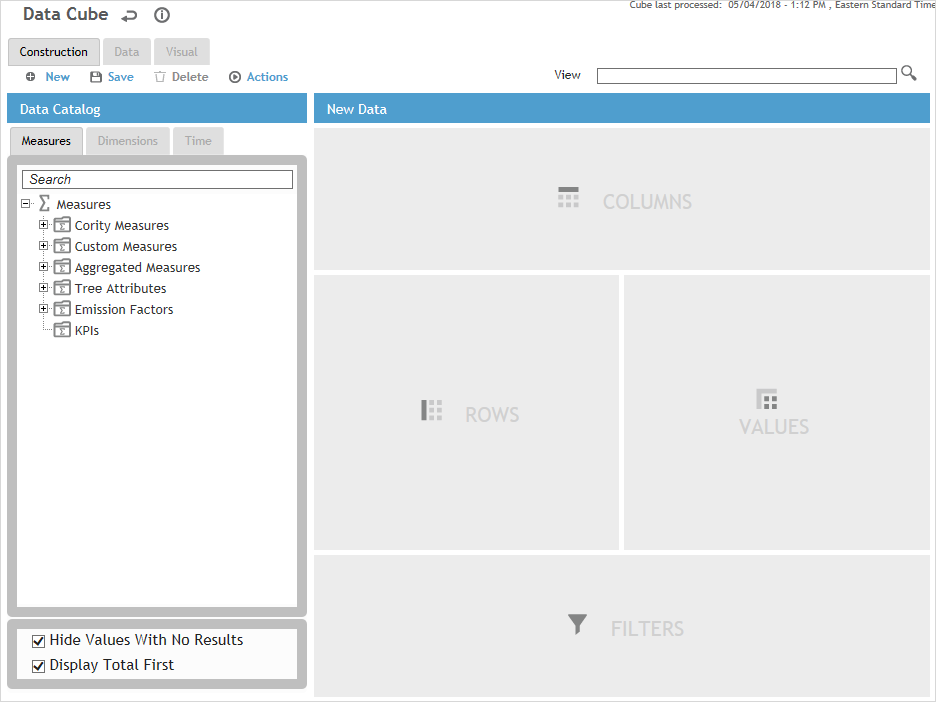
To improve performance and usability, select the Hide Values With No Results check box.
You can also turn off one or more of the GDDLOFB trees via the system
settings.
By default, summary data for a parent element is listed below its child
elements. To have it listed before, select the Display
Totals First check box. This is useful in the Advanced
Dashboard so that you can see the totals and choose to expand the
data if you wish to drill down.
Open a view to edit or to base a new view on, or click New to clear any information. The View picklist is limited to views that you have permission to see. By default the list is sorted by Standard Metric first, then by Name.
Drag at least one item from each tab in the Data Catalog to the appropriate drop area on the right (compatible drop areas are highlighted as you drag an item). You should not put two unrelated measures into the same Data Cube table/graph. Although technically you can add as many measures as you would like to a Data Cube query, this is not best practice and can cause performance issues, especially if the Organizational Tree is complex. You should only add the measures you absolutely need.
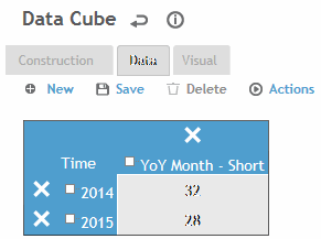
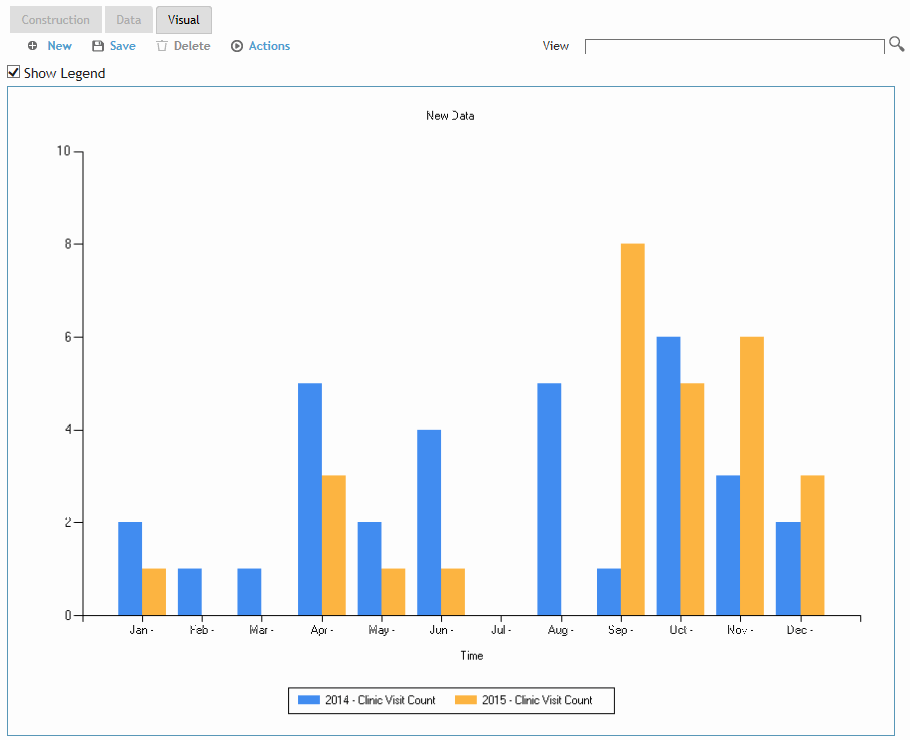
In the following example, the cube will report on the Clinic Visit Count [Value], grouped by Month [Column]. The data will further be broken down into Rows for each month of 2014 and 2015. Only data for Bakersfield will be included [Filter].
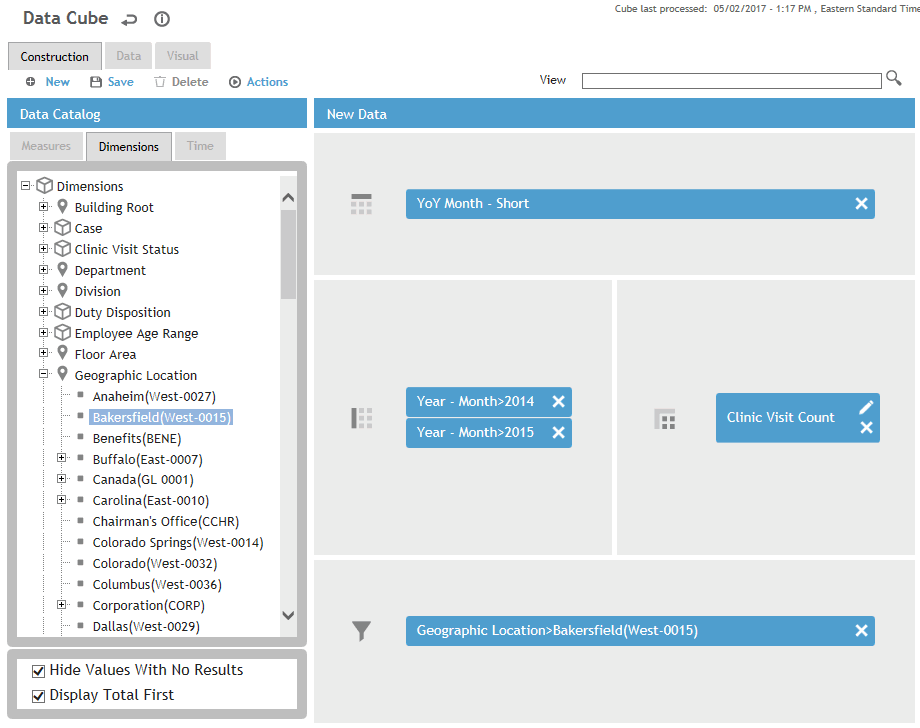
The Measures tab includes Cority measures,
custom measures that have been approved, aggregated measures, Organization
Tree attribute fields, and any emission factors defined in the EmissionFactor
look-up table.
Measures defined as KPIs are listed separately with their component
properties (Value, Goal, Status, Trend). You can drag the entire measure
or individual properties. If you drag the entire measure you can remove
individual properties from the Values drop area.
If you drag KPI Metric, KPI Metric Status, or KPI Metric Trend measures
to the Values section, the Visual Type for any existing measures in
the Values section will become Table. If you drag KPI Metric Value
or KPI Metric Goal to the Values section, the Visual Type for the
measure will become ‘Bar (vertical)' and the Visual Type for any other
measures in the Values section will not be affected.
The Dimensions list only displays values that work
with the selected measures; if you find the values in the Dimensions
tab take a long time to load, turn off the Allow
translations for the datacube system setting to enhance
performance. You can double-click a dimension to open the corresponding
look-up selector and select multiple values to be included. Each Dimension
list also includes an “Unknown” value so that the data can include
entries for which the selected dimension was not populated.
Both Dimensions and Time dimensions can be dropped into either the
Columns or Rows drop area where they will group data into columns
or rows respectively.
If you want to generate rates related to employee hours of work, ensure that the EmployeeHoursOfWork table is populated.
If you delete a measure from a view, dimensions that only applied to that measure are deleted from the Dimension drop areas (Columns or Rows) in that view, and they are also deleted from the Dimensions tab within that view.
To filter your data, drag any Time Dimension or Dimension to the Filters drop area. These must be a sub-level to the Time (or Dimension) selected for inclusion. For example, you may have selected an entire year but want to exclude a month from that year.
Time Dimensions are special dimensions in the Data
Cube, used to filter data by a desired time range. The domain of time
available to slice data is defined in the FiscalPeriod look-up
table; if a date is not included in the table, then records with that
date will be aggregated into the Unknown category.
All measures have different context to the Time Dimensions. For example,
the Time Dimension's context is the record's Test Date when used with
the Audiometric Test Count measure, and Exposure Date when used with
BFE Test Count measure. For a complete list, see Time
Dimension Context.
For each measure,
click  to select options for organizing, visualizing
and analyzing the data:
Select a visual type. If you choose one of the stacked chart types, each dimension used in the Rows area becomes a different segment of the stacked chart. You cannot combine a “table” visual type with any other visual type; see also the Note in step 3 above.
Select how the data should be aggregated. The options are as follows:
Values (default)
displays the exact value of the measure
YTD
displays the computed Year-To-Date values
3M R-Avg
displays a rolling 3 month average
6M R-Avg
displays a rolling 6 month average
12M R-Avg
displays a rolling 12 month average
For charts only: Select a color for the series, or allow Cority to automatically assign a color.
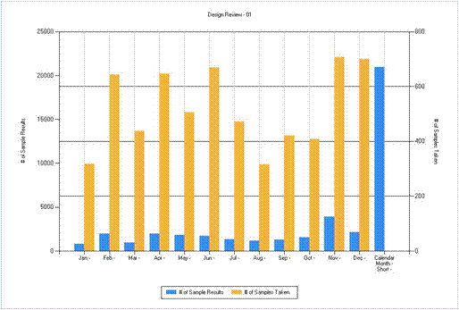
For charts only: Optionally, plot the measure against a secondary y-axis so that you can view and compare two related series of different magnitudes.
If you created a new view, click Save and enter a name for the view. If you edited an existing view, click Save to update it, or choose Actions»Save view as to save a copy of it under a different name. If you want this view to be available to other Data Cube users, select Standard View. Click OK.
